It's that wonderful time of year again. The leaves have changed their colour. The Braves have blown the division. And OPC hockey has been released into the wild. Just like clockwork. Consistency is comfortable.
Of course I'm all in after the set again. You knew that. So here are some pics to show what this year's set is all about.
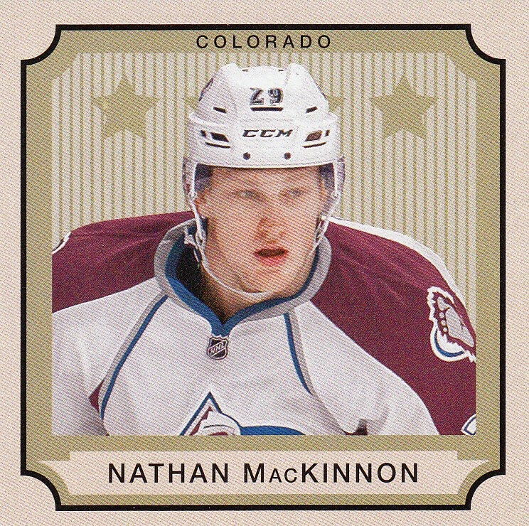
The base card. Overly large borders. While the O-Pee-Chee logo has shrunk over the last few years, the team name has increased in size. Having both the team logo and name is a wee overkill. Photos are mostly closely cropped onto one player.

The addition of a second photo is new, but they re-use the same photo from the front. So it's completely useless. A lack of career stats is disappointing.

After a brief break last year, this year has the return of the 50 SP high number rookies and matching 50 SP high number legends. Again... this is getting old. It's been done. Move on.


The other SP's are the legends.

No such way on the back to recognize the old timers, so you'll just have to do it the old fashioned way.
Google.

Again, there is a retro parallel set.

I think this is one of the rookies... not sure though.

No helmet! So he must be a legend.

In the red-headed stepchild category. The foil parallel. Does anyone collect these things?

In an effort to make a foil something that's wanted... they add a black border and number them /100.

Found roughly two per box, there are mini cards modelled after some old tobacco era card that I'm waaaaaay too lazy to research right now. Cut 2 1/2 x 2 1/2, they're kinda cool.
By now, certain Owls may have nodded off... or are at least wondering why they've read this much babble about cards featuring people they've never heard of.
But here is the payoff.
For the third year in a row, OPC has inserted a 100 card sticker set.
Et voila.


There are only four different colour varieties in the set. Stickers #1,5,9,13,17 etc are Green with Orange. #2,6,10,14,18... are Blue with Green. #3,7,11,15,19 etc are Red with Yellow. And #4,8,12,16,20 are the ever popular Purple with Pink.
It would be nice if there were a few more unannounced variations. But I'll take it.
If you zoom in on the top of the Jonathan Quick, you'll see an old fashioned OPC printers spot.
Awesome.
I wonder how they came up with this idea...
It's like if Henry Bucha had his way one night with Nolan Ryan.

+

+

=

Hey. You never know. It was the '70's.
5 comments:
Those are the best stickers EVER!!!!
And I do too have heard of those guys -- most of them.
My hockey card purchases have slowed down a little over the past year or so... but if and when I start collecting them again... I'll probably start with a box of OPC. Those stickers are beautiful.
Excellent!!!!
The stickers look fantastic. I would like a review on the Legends/Rookie thing. Why does OPC make things so difficult?
Nice seeing the Boucha and Ryan. Classic!
They're OK. I still prefer the flagship set.
They should have used the sticker design for the retro parallel set in my opinion. I also preferred the days when rookie cards just looked like the regular cards.
Post a Comment